Along with lighting, subject, perspective, composition is one of the fundamental tools to creating better images. It's one of the easier ones to begin applying to your own photography as well. Here are a few tips on improving your composition, with examples from a recent fitness photo shoot.
1. Rule of Thirds
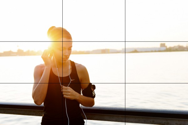
You've probably heard this one beat to death, but the rule of thirds is one of the fundamental keys in creating stronger compositions. It involves dividing an image into nine equal grids at the thirds. By placing your subject on the line of a third, or at the intersection of two thirds you're following your eyes' natural focus. We find photographs with the subject on one of these thirds simply more pleasing.
Take the below image for example, where this woman is placed on the left third line with the focus of her head near the top left third as well. It creates a more pleasing composition and gives the eye plenty of space to wander in the frame.

The rule of thirds isn't a hard and fast rule and it's often broken to great success, but that's a topic you can find in many other posts. It's a great starting point though to create stronger compositions.
2. Second Point of Interest
Applying the rule of thirds, you can now try adding a second point of interest into your images. Adding a secondary point, whether it's out of focus in the background or in focus with a deep aperture landscape, gives your image a natural viewing progression. Your eye starts at the first focal subject and then moves along to the second. Not only does this create more interest in your image, it can help reinforce a theme or perspective.
In this fitness image, the woman tying her shoe and preparing for a run is the clear focus of the image. Introducing a second runner in the background now creates another place for the eye to follow through the image. At the same time the "running" theme has been reinforced. Additional factors in leading the eye are; her gaze into the open space of the image, and the leading lines of the banister and concrete blocks.

3. Room for Copy Space
If you ever have aspirations to shoot for advertising agencies and many editorials, learning to leave room for copy space is a must. Copy space is the negative area in an image where a brand will place their tag line, logo or product/information. Generally you want this negative space to not be too busy, so that the copy pops out. The effect can be achieved often by using a shallow focus in your images, or by simple ensuring there is a space without too much "busy-ness" in it. A nice open sky often works great in this regard.
In this shot there's some clear head space in front of the two runners that works great for copy. An important thing to keep in mind though if you do end up applying these principles for a client, is how the images will be placed in publication. Will they be on a poster or against a store wall? Or across the pages of a magazine? This particular image might not work well across a double page spread, as it places the subjects' heads right where the crease would be. Against a store wall it would work just fine. These are important placement ideas to keep in mind with copy space.

Bringing It All Together
When you bring all three of these compositional elements into mind you can create a great image that not only holds interest, but appeals to the creative people who hire photographers (always a big plus). The image below is an example when all three work together. The subject is at one of the third grid lines, there's a secondary point of interest in the background and room has been left below for copy space. When you keep all three elements in mind you'll be on your way to creating stronger compositions.

Post originally from: Digital Photography Tips.
Check out our more Photography Tips at Photography Tips for Beginners, Portrait Photography Tips and Wedding Photography Tips.
3 Ways to Improve Your Images With Composition
No comments:
Post a Comment