In previous articles I wrote about the concept of balance in relation to the colours orange and blue, and in relation to composition in the square format. Today I think it will be interesting to explore the concept of balance in relation to photographic composition in more depth.
Central composition
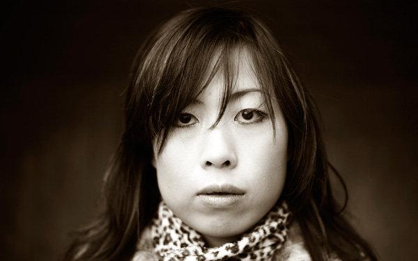
This is a portrait that I created with a central composition. There are a couple of interesting things going on here. One is that the composition is virtually symmetrical. One half of the image is a mirror image of the other, with a few variations. In this case, that reinforces the sense of balance created by the central composition.
What happens if we crop the image to move the girl's face off-centre, closer to a third? Let's take a look. Here I've cropped it to the 4:3 aspect ratio:
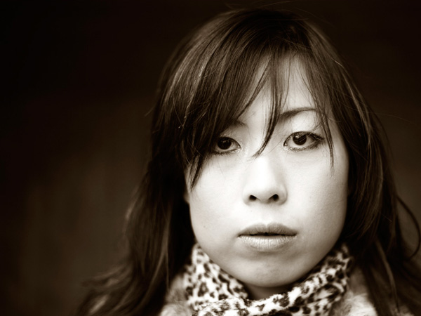
Do you see the difference? In this example the eye is encouraged to move around the frame more by the off-centre composition. Placing the girl's face off-centre has created a more dynamic composition.
The first version is about balance, the second is about being off balance and adding a kind of tension to the image. The subject is the same, but one simple variation in composition creates two different effects.
Tonal contrast
The portrait is also an interesting study in tonal contrast. The light tones of the face and scarf contrast with each other. Roughly one-third of the image is made up of light tones, and the rest dark tones. What we're looking at here is an example of what some photographers refer to as visual mass. Light tones pull the eye more than dark tones. Therefore, to create a balanced image, there needs to be more dark tones than light tones. If the ratio was around equal, the image wouldn't feel so balanced.
This is what happens if we crop the portrait to a square. The ratio of light to dark tones is about even. But the sense of balance between dark and light tones in the original has been lost:

Here's another example of balancing the visual mass between light and dark tones:
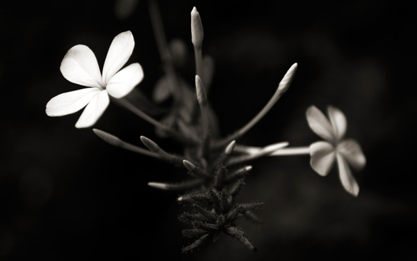
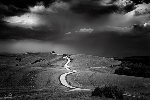
Now, here's another example to illustrate the same concept:
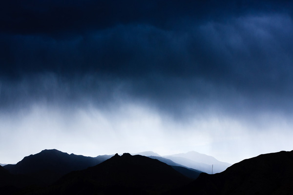
The photo is split into three bands. The strips of dark tones at the top and the bottom are balanced by the band of light tone in the middle.
There are other ways this image is balanced too. The mountains occupy the bottom part of the frame, and are balanced by a large expanse of stormy sky. The mountains have more visual mass than the sky, therefore the photo benefits from having more sky in it.
The telegraph pole in the bottom right third is the focal point of the image. It has a lot of visual mass, assisted by its placement on the thirds. The visual mass of the telegraph pole is so strong that even at this small size it is balanced by the rest of the image.
Finally, an image with a composition that at first glance seems to be at odds with what I said earlier about tonal balance:
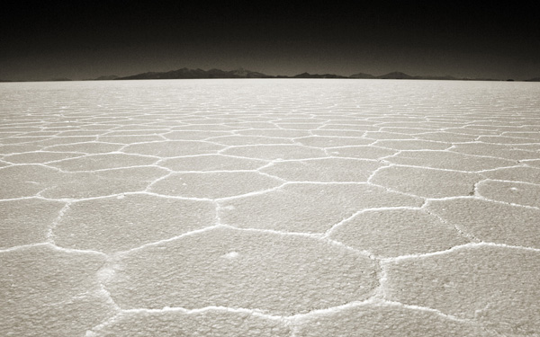
In this image, the light tones of the salt flats are balanced by the brooding dark tones of the mountains and sky in the distance.
The thing about visual mass and balance is that they are difficult concepts to condense down into rules like the rule-of-thirds. Every scene is different and the best composition may depend as much upon your intent (ie. would you like a balanced image, or a less balanced one with more dynamic tension?) as it does upon the subject.
One of the best ways to improve the composition of your images is to read as much about these concepts as you can, absorb them, and then compose according to 'feel'. Does the image feel right when you look through the viewfinder? As your understanding of composition improves, so will your photos.
Mastering Photography
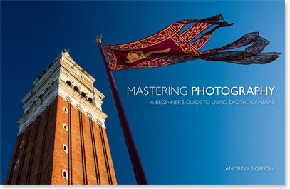
My latest ebook, Mastering Photography: A Beginner's Guide to Using Digital Cameras introduces you to digital photography and helps you make the most out of your digital cameras. It covers concepts such as lighting and composition as well as the camera settings you need to master to take photos like the ones in this article.
Post originally from: Digital Photography Tips.
Check out our more Photography Tips at Photography Tips for Beginners, Portrait Photography Tips and Wedding Photography Tips.
Composition, Balance and Visual Mass


